Port Authority of New York & New Jersey Airports — New York & Newark, United States of America
Client
PANYNJ
Scope
14 terminals
Date
2019-ongoing
Architects
Mott McDonald, Grimshaw
Collaboration
W&CO
Photography
Zach Griff

Authority Through Design

Over the last decade, the Port Authority of New York and New Jersey (PANYNJ) saw its ASQ ratings steadily fall, surpassed by new and renovated airports.

Even then-Vice President Biden described LaGuardia as akin to a “third-world airport.” As part of significant investment into its aviation facilities, the Port Authority approached our design team to analyze, rethink and refresh its Wayfinding Standards. This provided a singular opportunity to refresh the airport wayfinding system to provide a unified, cohesive, 21st-century experience.

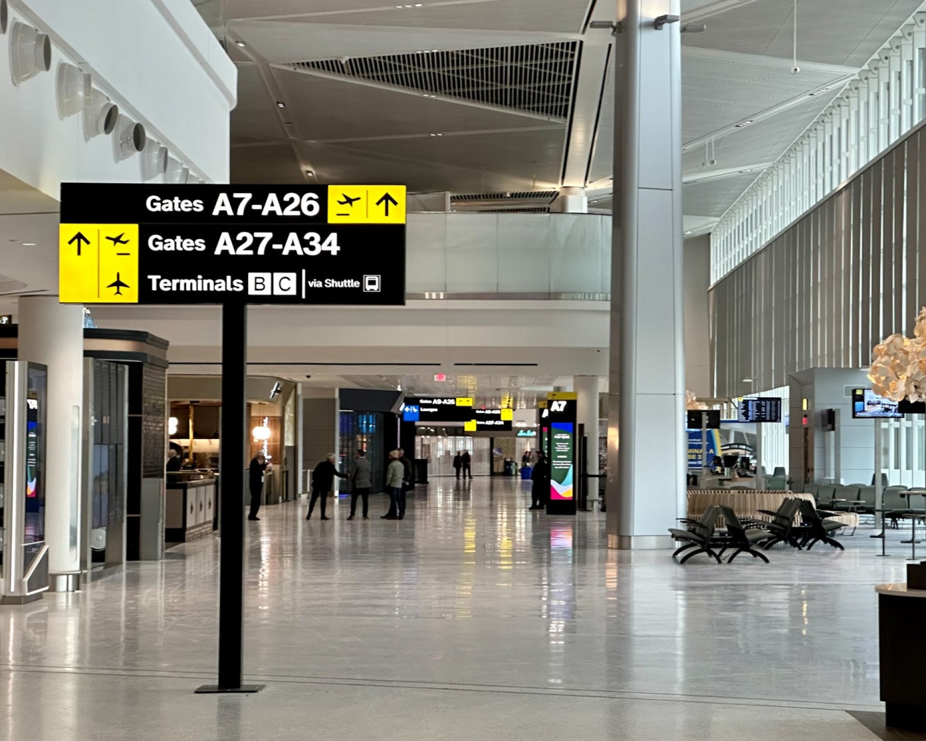
Mijksenaar undertook a top-to-bottom revamp of the Wayfinding Standards to proactively address a rapidly evolving industry and redevelopment of the airport network. We completed an exhaustive review: site visits to 14 terminals; conversations with airport staff and observations of passengers; comprehensive analysis of the existing manual; and best practices in and outside the field. After implementation, this wayfinding manual won the 2021 SEGD Honor Award.

+ Read more- Read less
Client
PANYNJ
Scope
14 terminals
Date
2019-ongoing
Architects
Mott McDonald, Grimshaw
Collaboration
W&CO
Photography
Zach Griff
 

Orientation

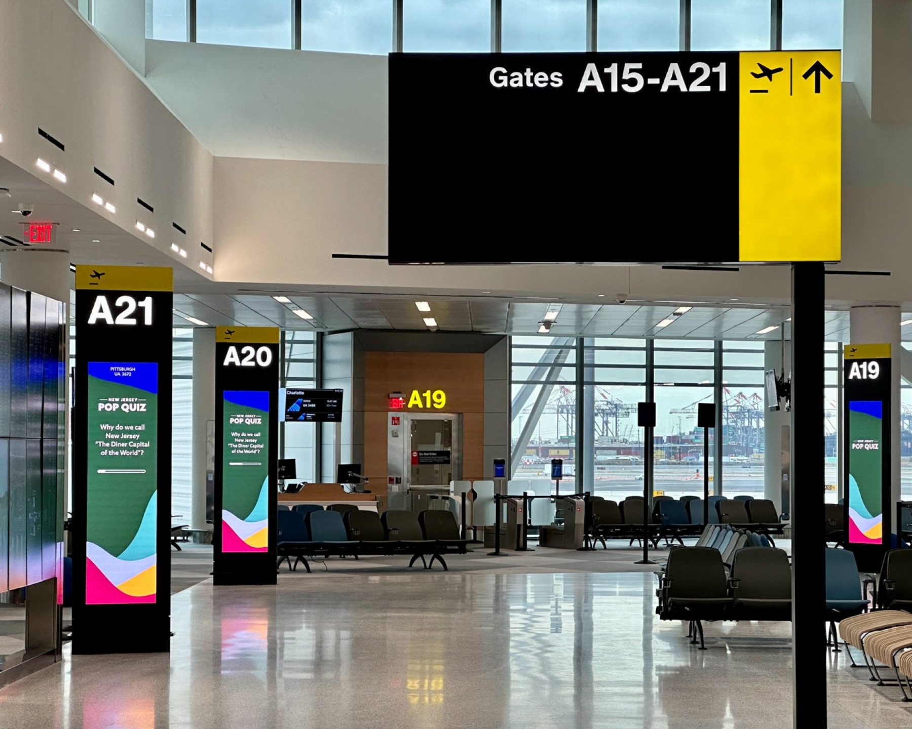
The core of the Wayfinding Strategy, as originally designed nearly 20 years ago, has been enhanced but has the same fundamental core. It provides direction to travelers with a focus on departing and arriving processes. Information is color coded and priority is given to guidance for flight related information with an eye to the gate for departing passengers or to onward transportation once they have landed at the airport.

@thepointsguy


Navigation

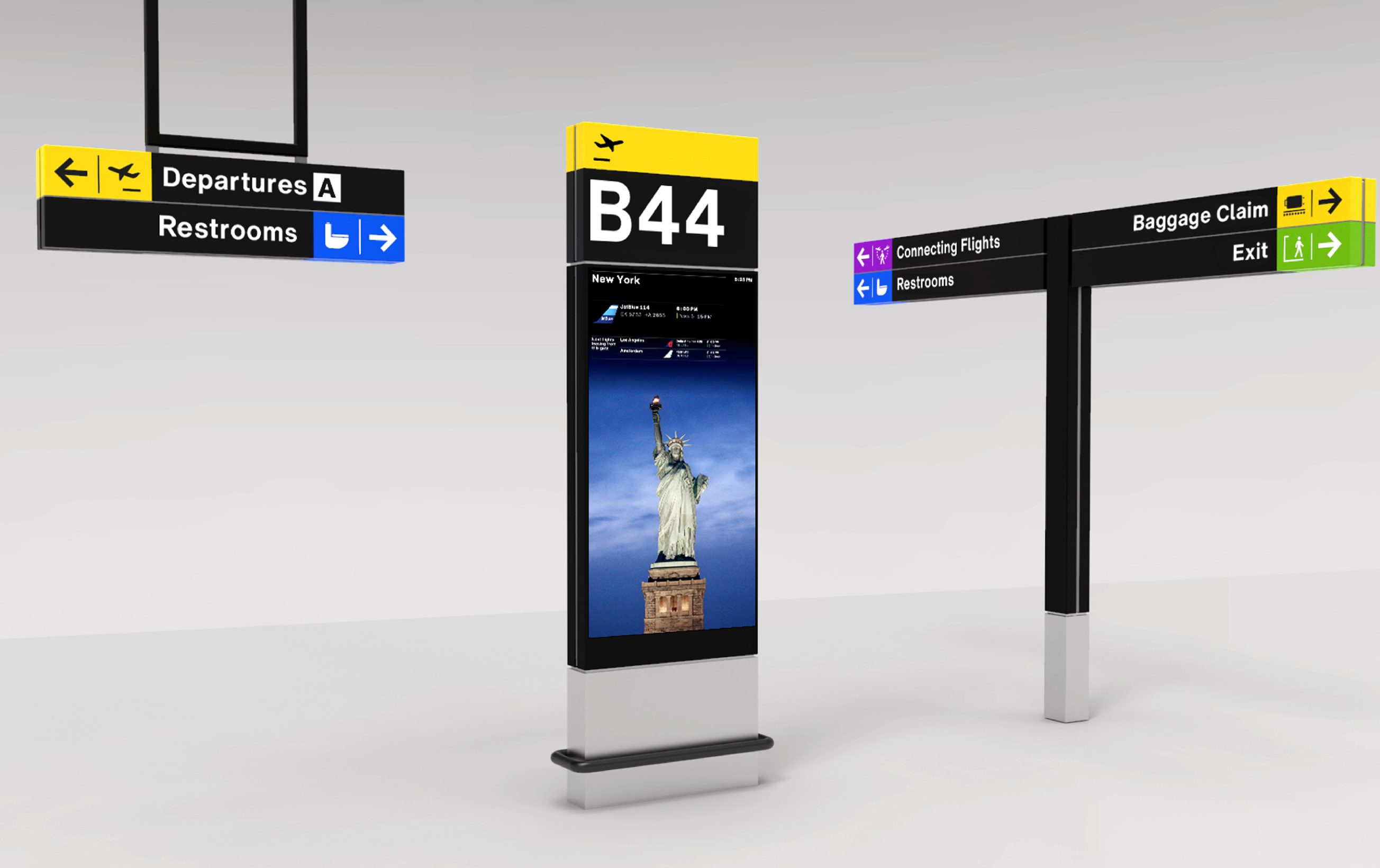
The color coded system guides passengers through the complex process of departure, navigating parking, multiple terminals, transfers, check in, security and other processes required for today’s air travel process. The color coding informs everything from directional signs, flight information displays, maps and directories, to keeping the passengers focused on their travel journey.


Experience

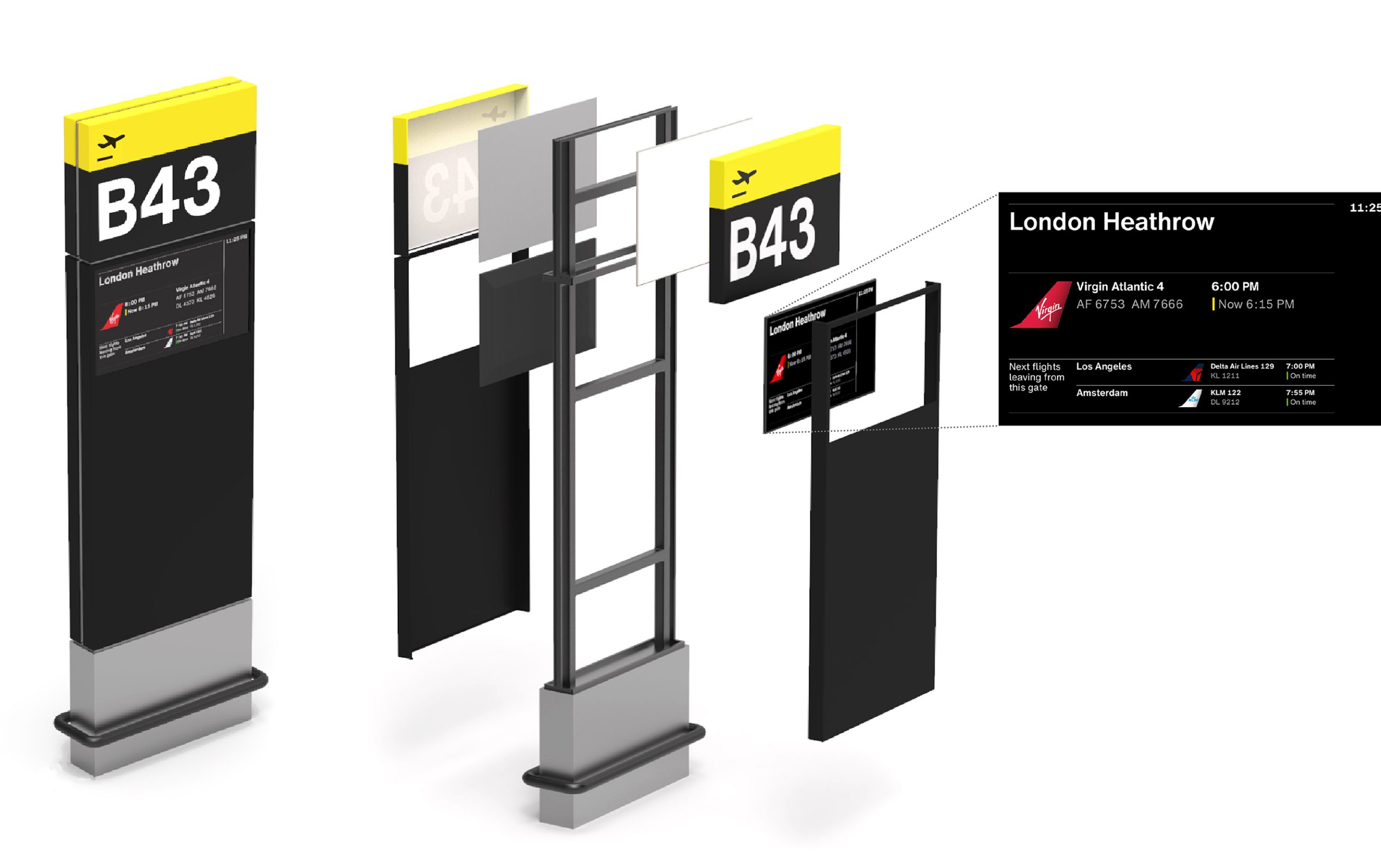
The new design evolved from the need to modernize the system and have a connection to the surrounding New York Metropolitan area. The design echoes the design vernacular of New York City and its surroundings through vibrant use of bold colors; subdued, sleek black backgrounds; and a newly stylized Helvetica typeface.


Result

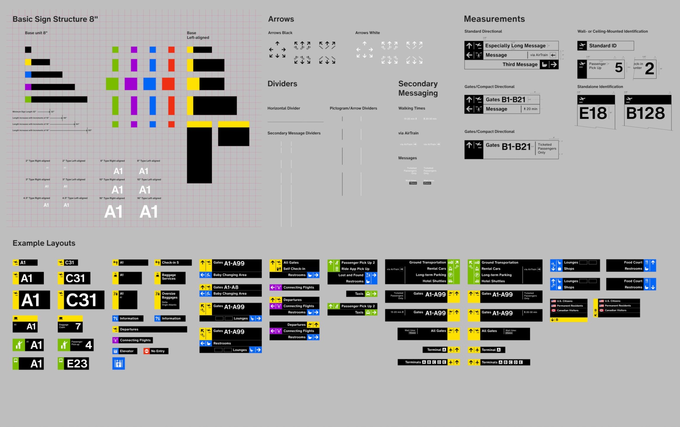
The result is an easy-to-use, comprehensive wayfinding manual that sets a new standard. It includes core principles and strategies and detailed guidelines and specifications, providing everything needed to implement and maintain an exceptional wayfinding system across Port Authority airports for years to come.

The published, updatable online manual is easily accessible by operators, designers, and stakeholders. These guidelines are crucial to maintaining the following:

  • Wayfinding Strategy
  • Sign design
  • Online manual

Take a look at the Airport Standards Manual for Wayfinding


< back to Projects

Let's talk wayfinding.


Let us make your travelers our priority. Our globally tailored solutions can solve your complex airport, train system, or highway logistics challenge.


Contact us