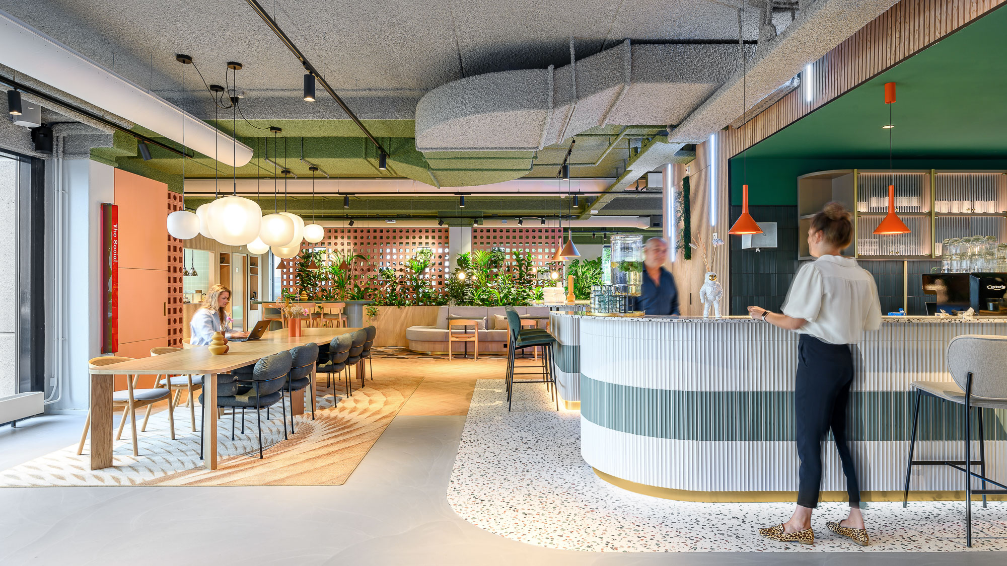
Het Nieuwe Kantoor (HNK), isn’t just a workplace; it’s a vibrant hub where professionals thrive. With a flexible office concept, ‘Offices to Grow,’ hospitality, sustainability, well-being, and convenience are prioritized. We translated this expression of identity into wayfinding, and are implementing it across locations.
Offices to Grow
At HNK, a core value is that job performance and comfortable workplaces go hand in hand. We share this belief and understand that achieving comfort is not only about orientation, navigation, and overall user experience- but also about a personal, unique twist. With our ‘Growing Dimensions’ wayfinding, there is a new experience to be found each time.
Orientation
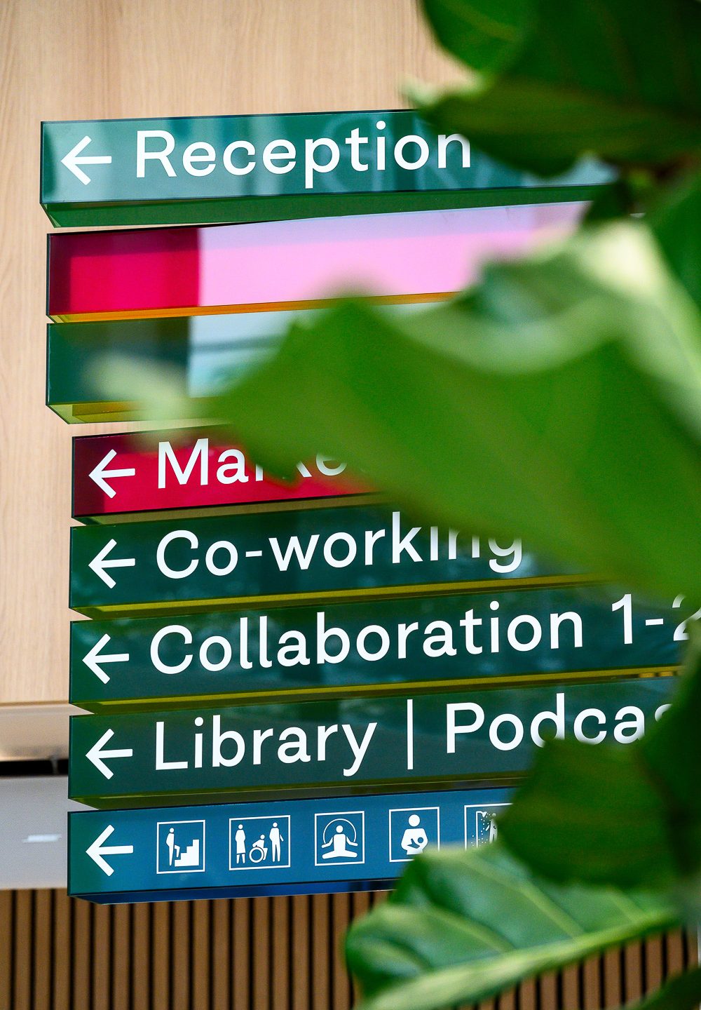
Navigation
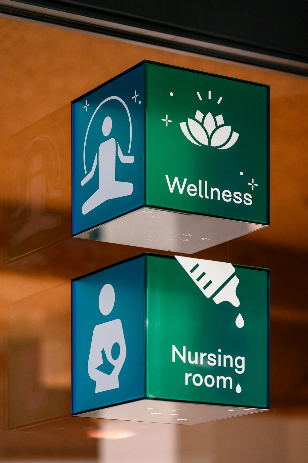
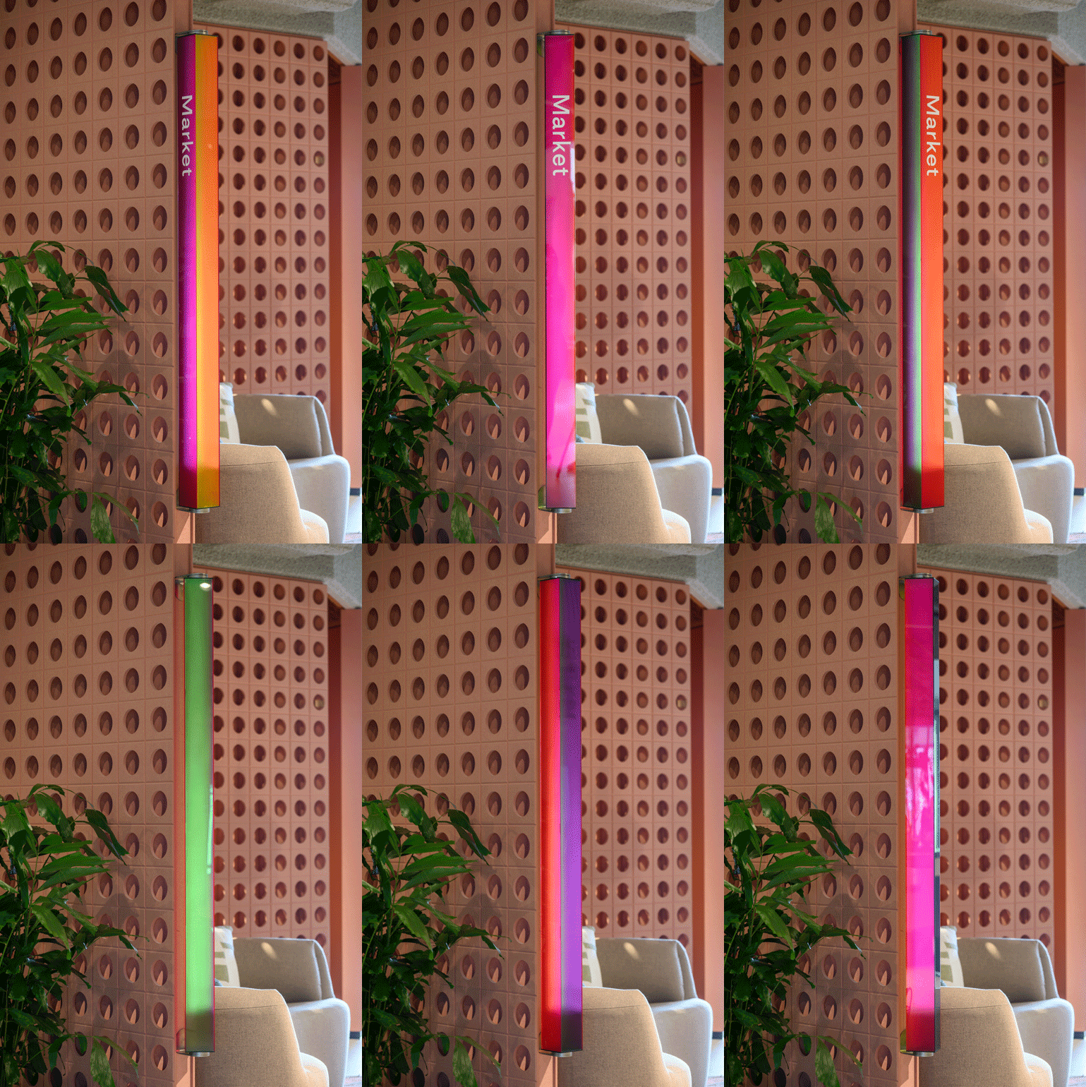
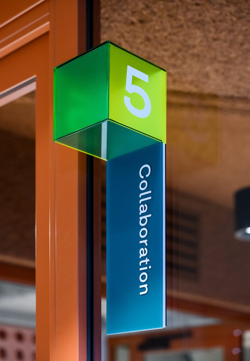
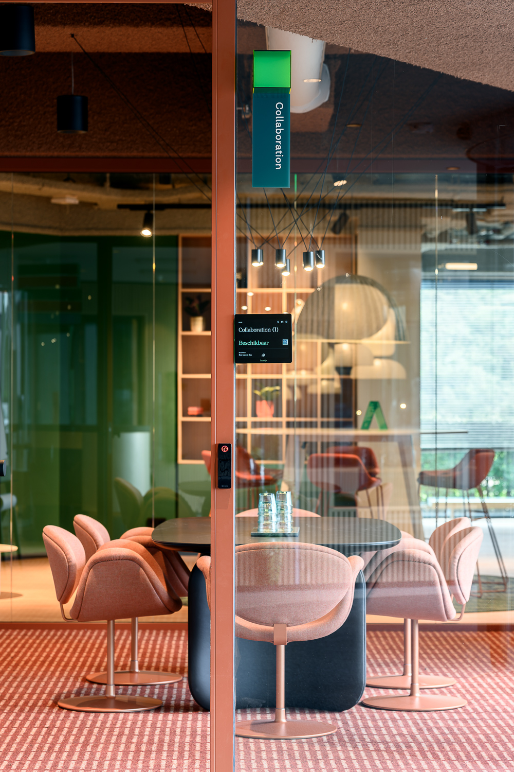
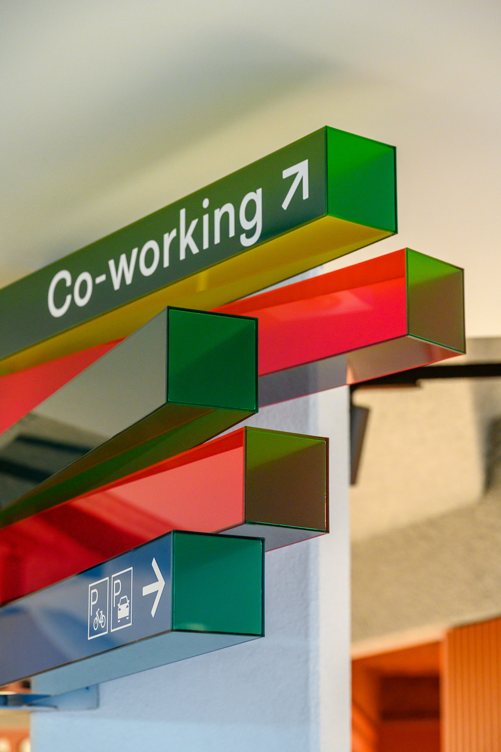
We incorporated HNK’s vision for a flexible office concept into our strategy, resulting in ‘Growing Dimensions’—a completely bespoke 3D wayfinding system. The square is the basis of navigational communication, and it can grow and branch out horizontally or vertically depending on need. Depending on the destination, the colors have been selected to suit the level of interaction- for group work, hues are more vibrant, and for independent work, much more muted. This was done to program the space and connect beyond just information.
Experience
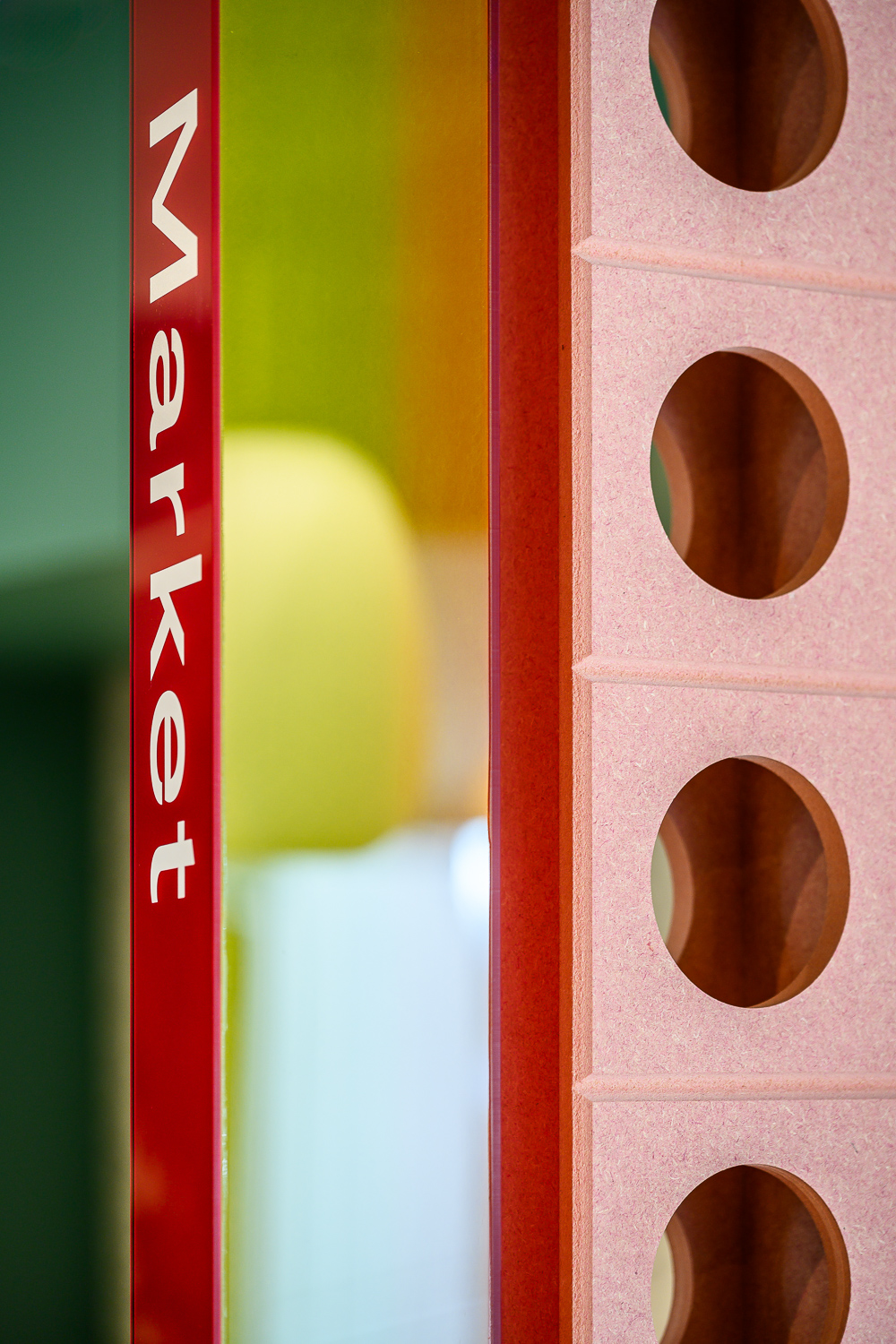
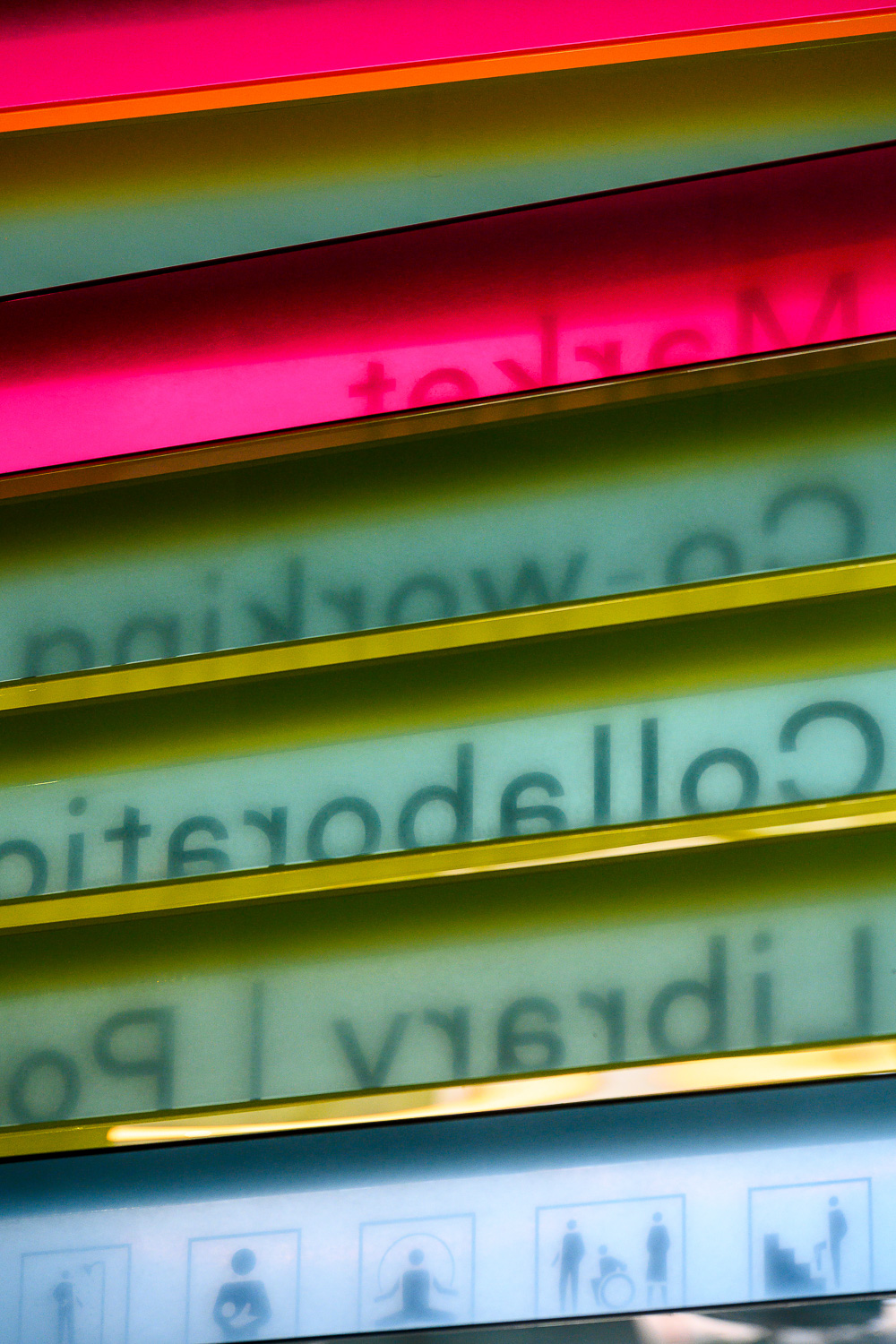
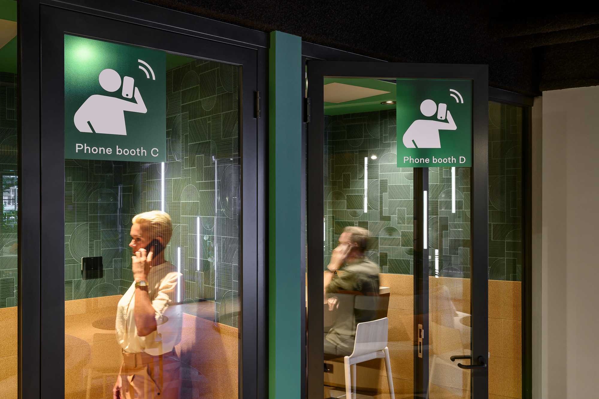
To stimulate creativity and give the returning users something new each time, we brought the Prisma cube into play. This material can be transparent and allows interactions with light and movements, which results in unique color combinations and visuals. The colors of the wayfinding elements adapt to the lighting conditions and user movements, ensuring that visitors enjoy a slightly different experience with each visit, displaying shades of green, blue, yellow, or pink. Combining this with a color strategy for different zones allows the user to take mental ownership of the space. To tie it all together with a ‘human’ touch, we made pictograms with quirky movements that go beyond surfaces, telling new stories on each 3D face and adding identity through wayfinding.
Related projects
Your office space needs growing, too.
The changing demands of workspaces require them to be comfortable, unique, and stimulating spaces for employees. Reach out to see how we can bring your building to the next level!

