Booking.com City Campus — Amsterdam, the Netherlands
Client
BPDScope
72,500 m2Date
2018-2023Architects
HofmanDujardin, UNStudioCollaboration
CBRE Design Collective, HofmanDujardin, i29 interior architects, Linehouse, Studio Modijefsky, UNStudio, MOSS, Powerplant, Scholten & Baijings, Studio RublekPhotography
Heroshots, Meijer MijksenaarThe Workplace of the Future
With connection, health, and well-being as the foremost values, the headquarters is a testament to a modern workplace with the ideal conditions for its valuable workforce. In order to compete with other tech capitals around the globe and attract the best talent, the campus has to represent the highest standards of inclusivity, efficiency, health, and well-being, including an identity-driven wayfinding system.
Client
BPDScope
72,500 m2Date
2018-2023Architects
HofmanDujardin, UNStudioCollaboration
CBRE Design Collective, HofmanDujardin, i29 interior architects, Linehouse, Studio Modijefsky, UNStudio, MOSS, Powerplant, Scholten & Baijings, Studio RublekPhotography
Heroshots, Meijer Mijksenaar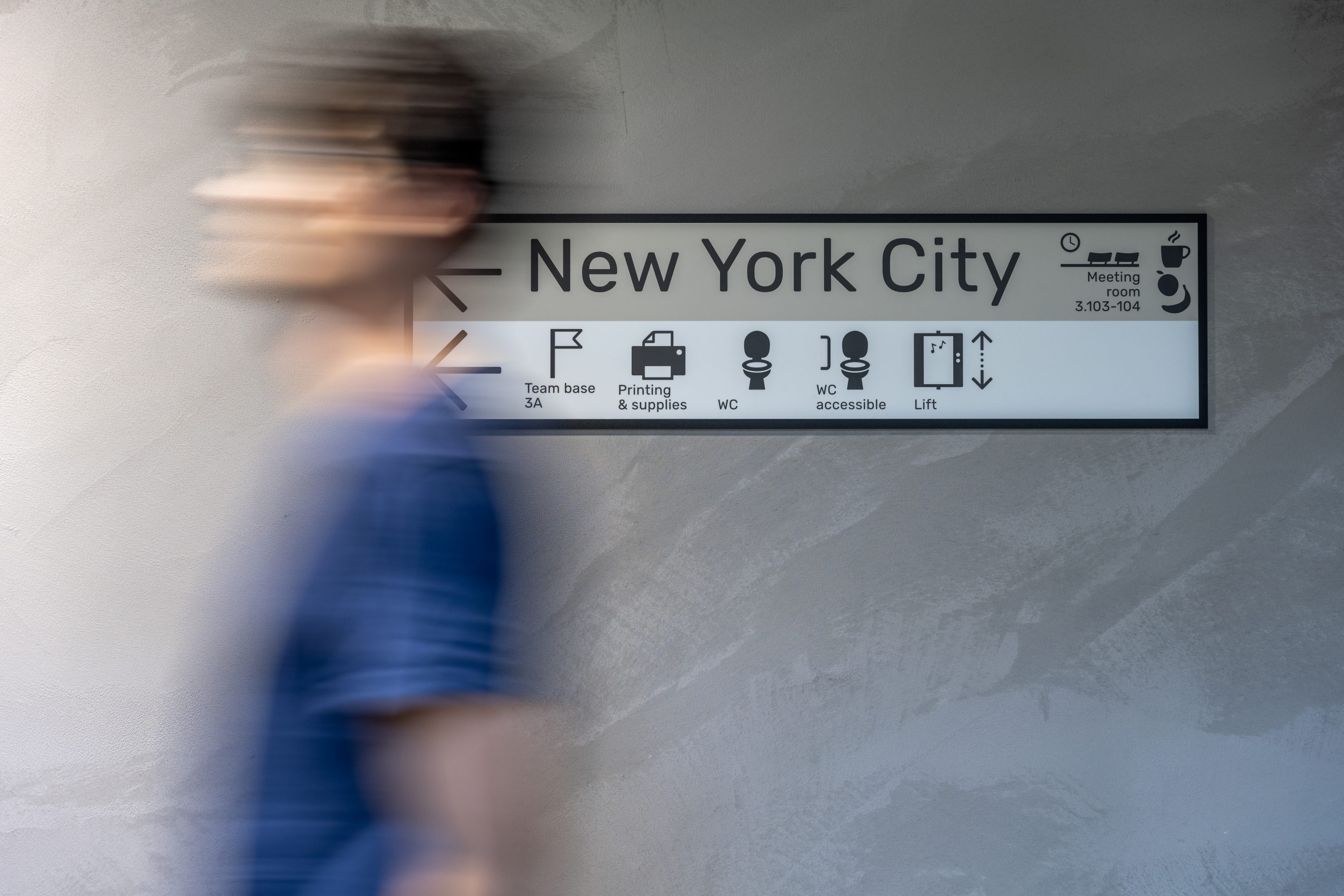
Orientation
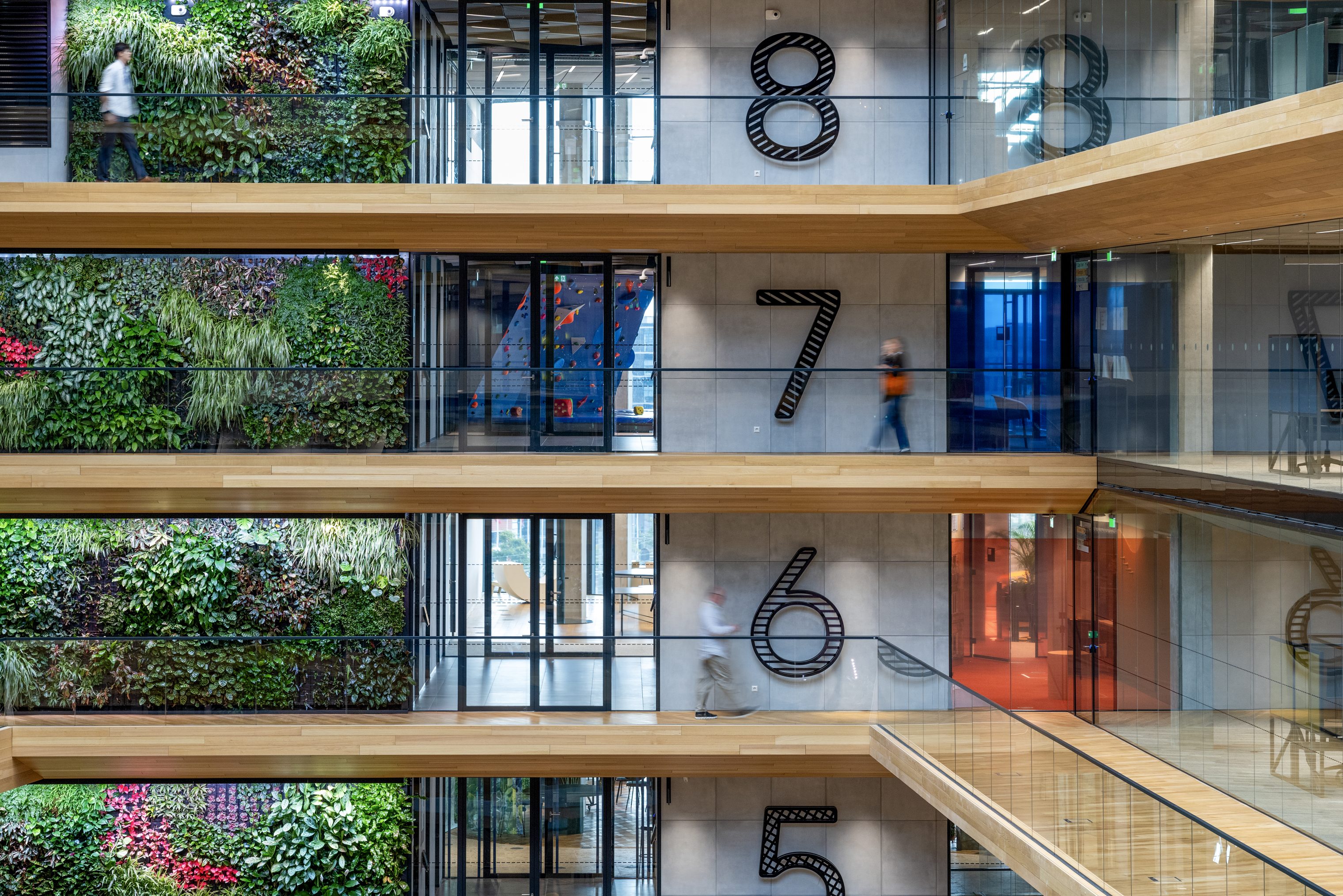
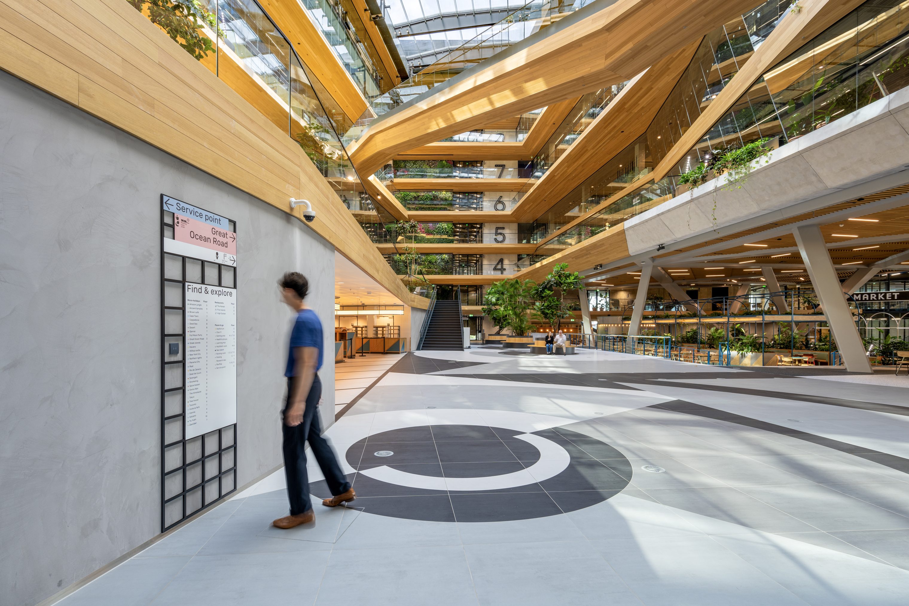
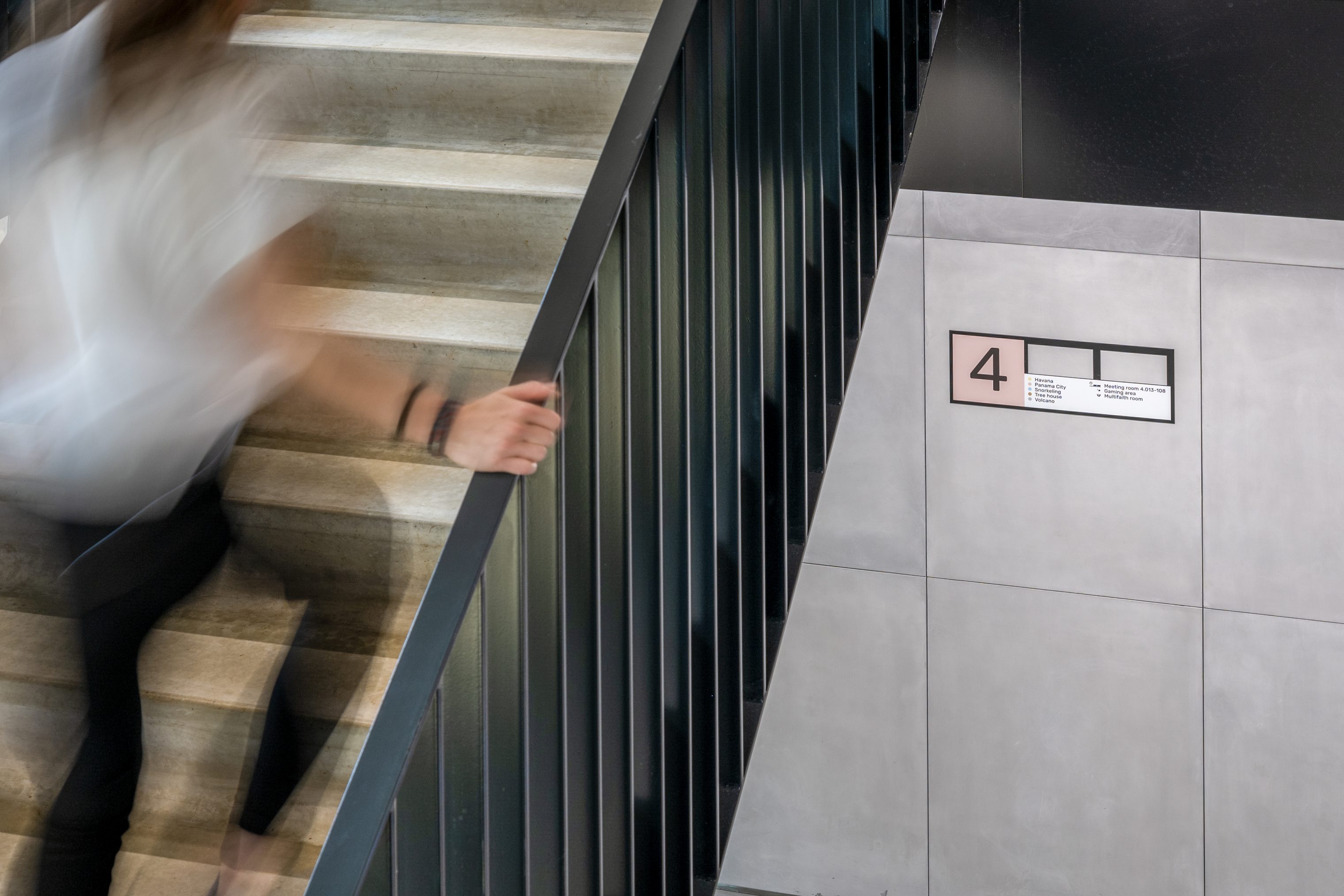
As wayfinders, we recognize implicit spaces as a primary navigation force. They also serve as cues for the visitor and shape the foundation of the wayfinding strategy. When entering the building, walk up the cascading stairs for a warm welcome and continue to the atrium, where beautiful light spills from the top. Here, you receive an overview of the floors while being greeted by the buzz of the restaurant and coworking hubs. We analyzed the legibility of existing architectural interventions such as reflecting glass, vast spaces, wooden pillars, and a sloped bridge and implemented an information layer accordingly. The right information at the right time, not too much and not too little.
Navigation
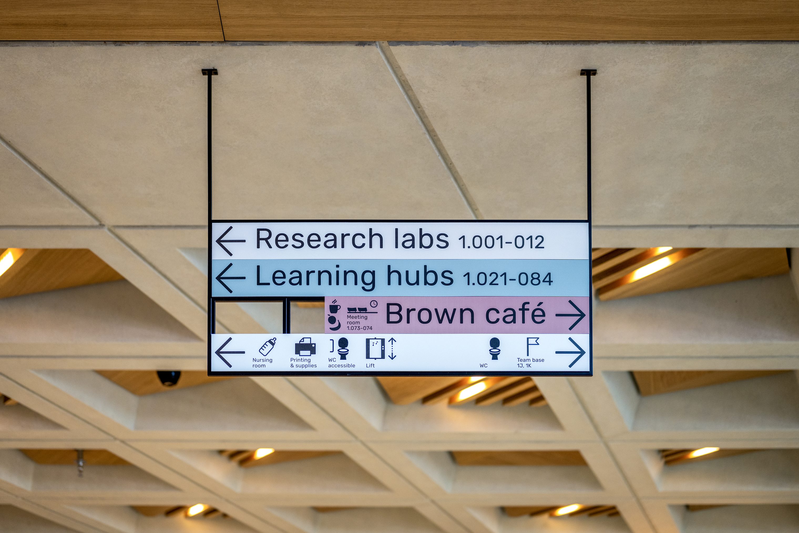
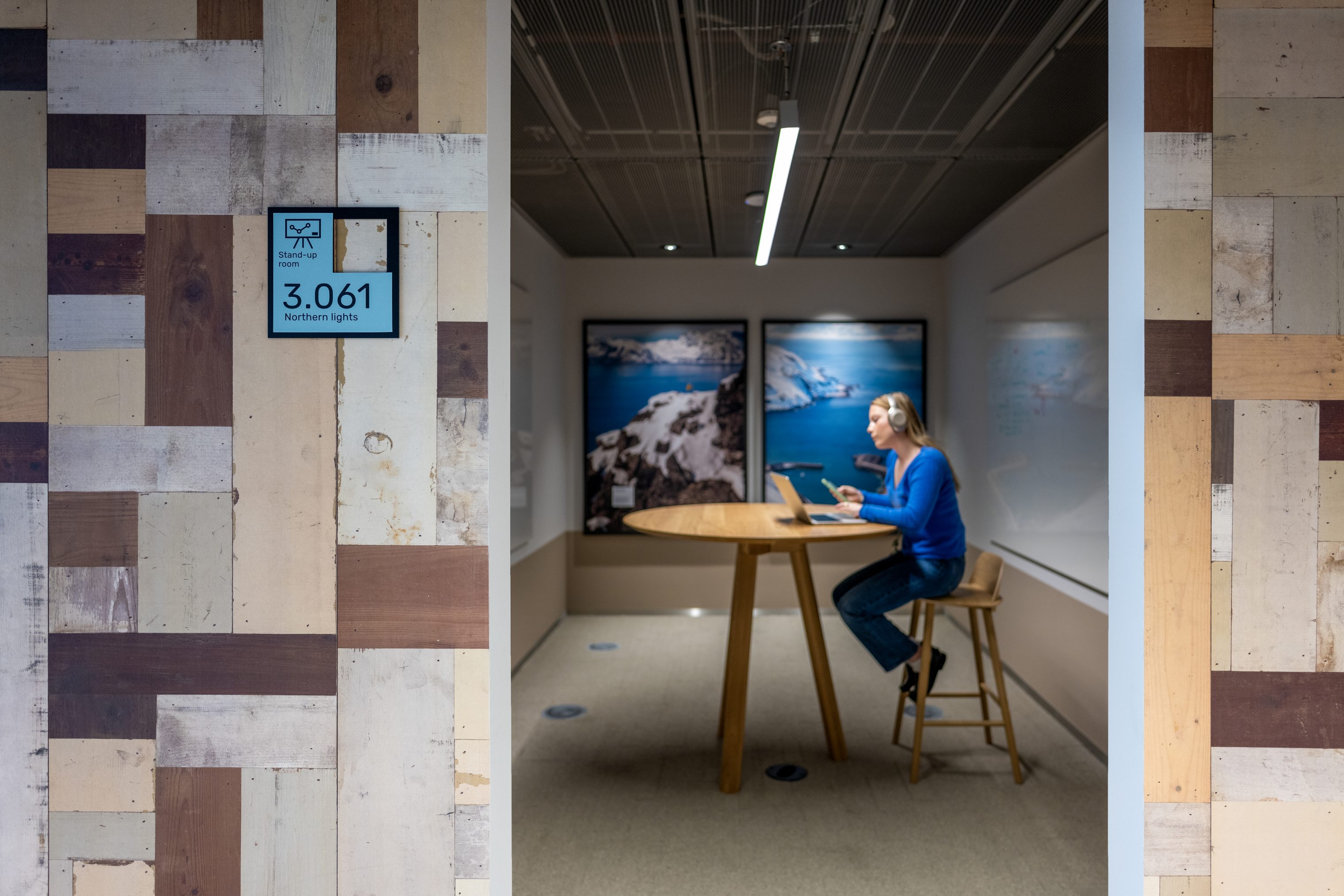
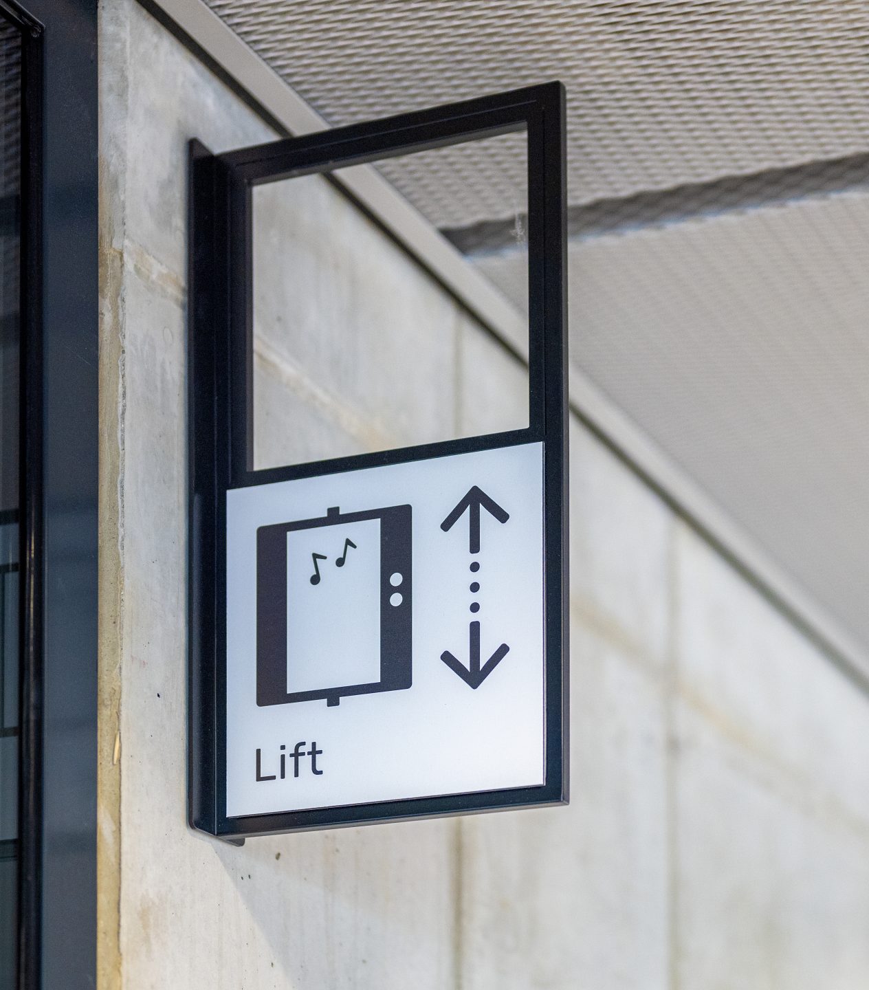
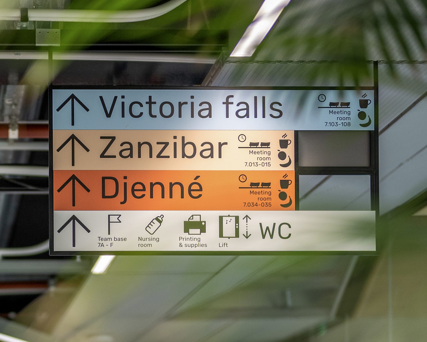
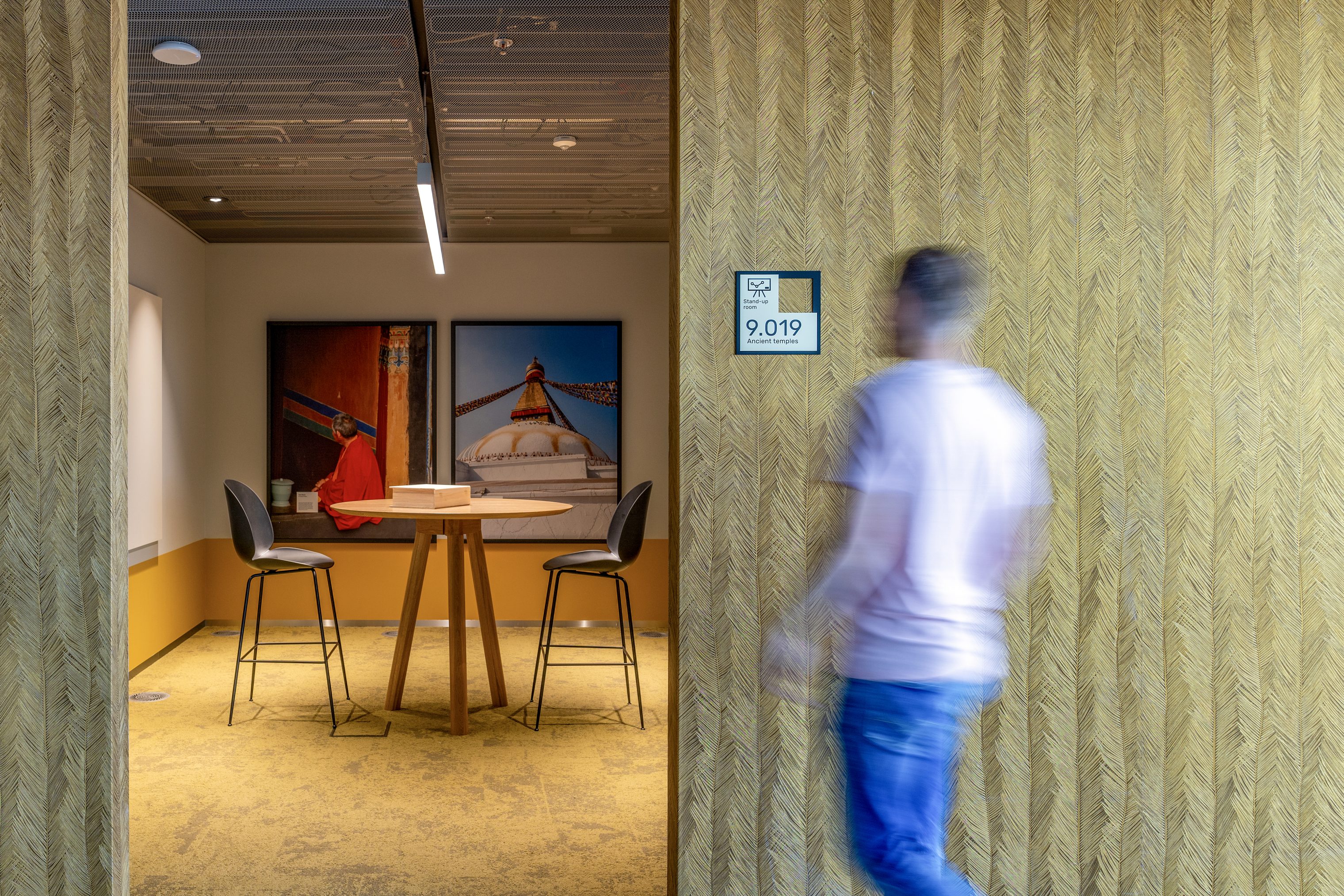
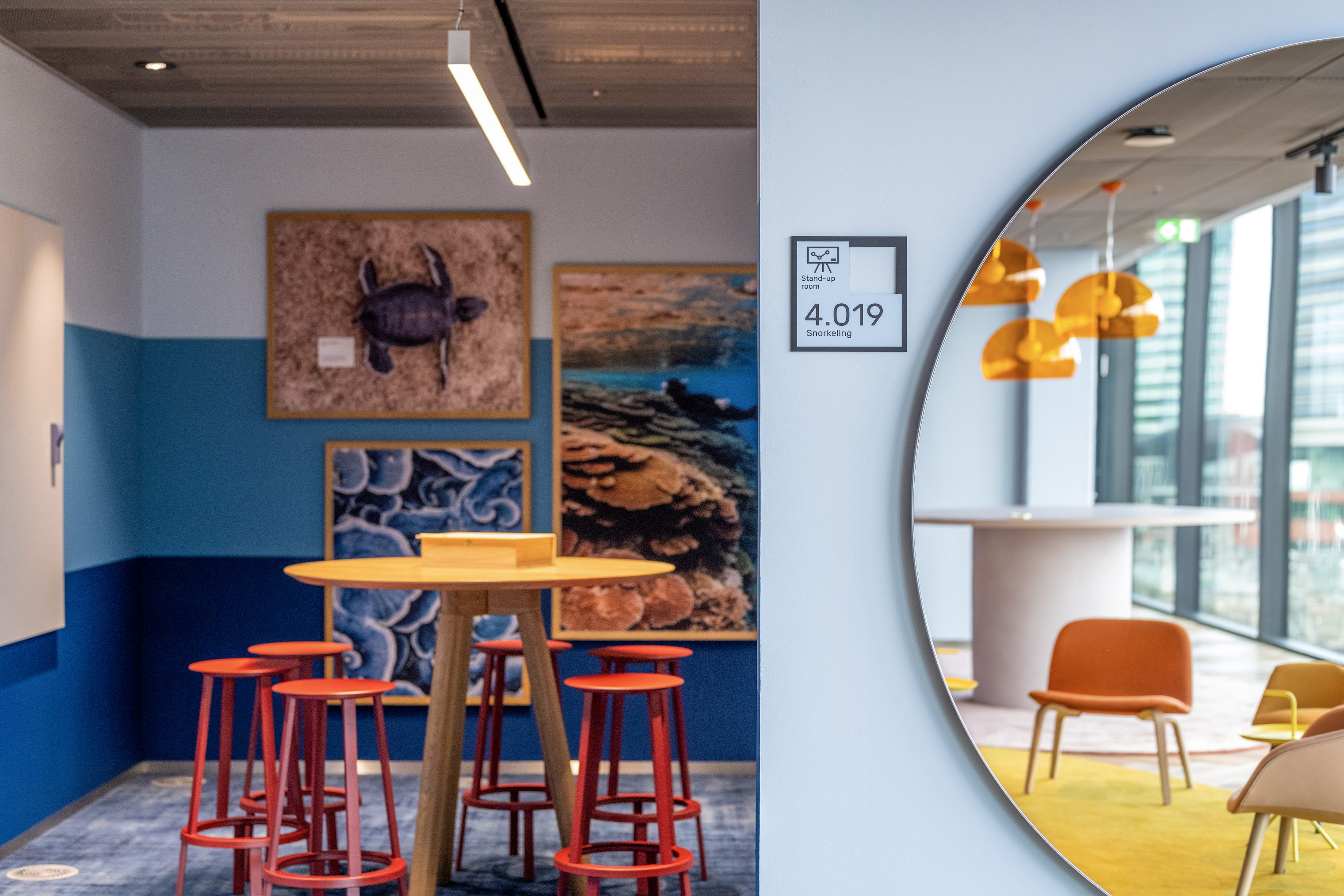
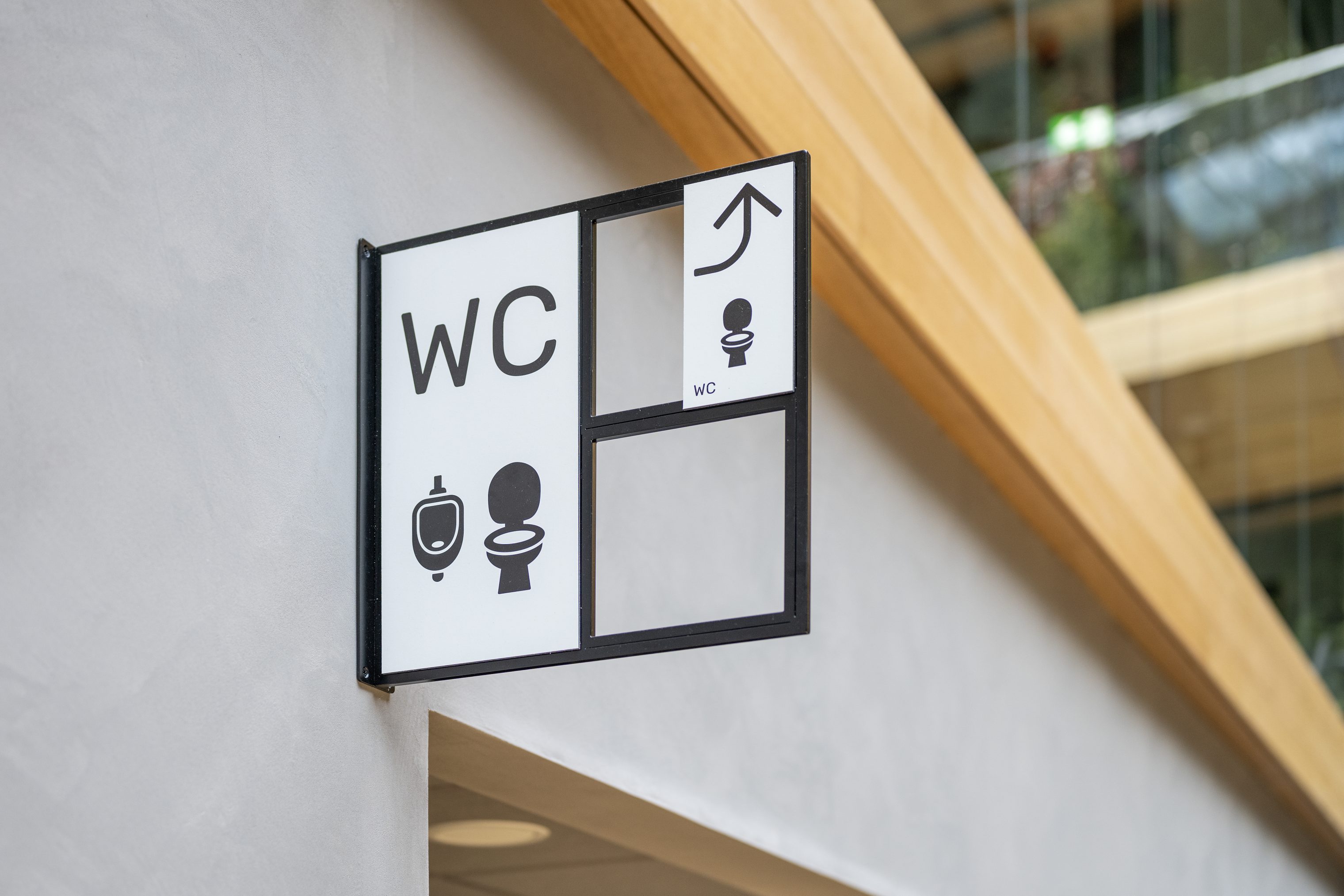
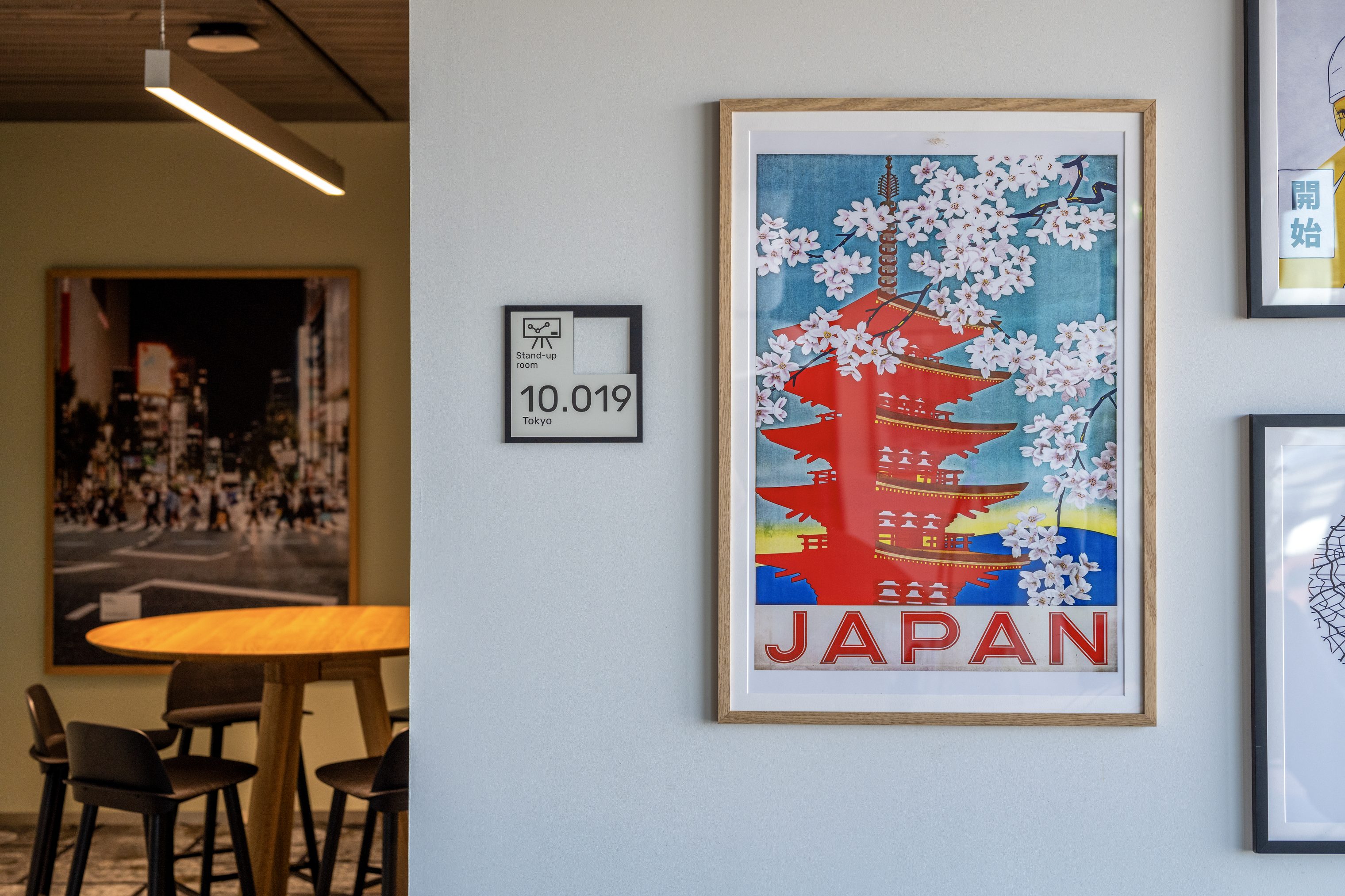
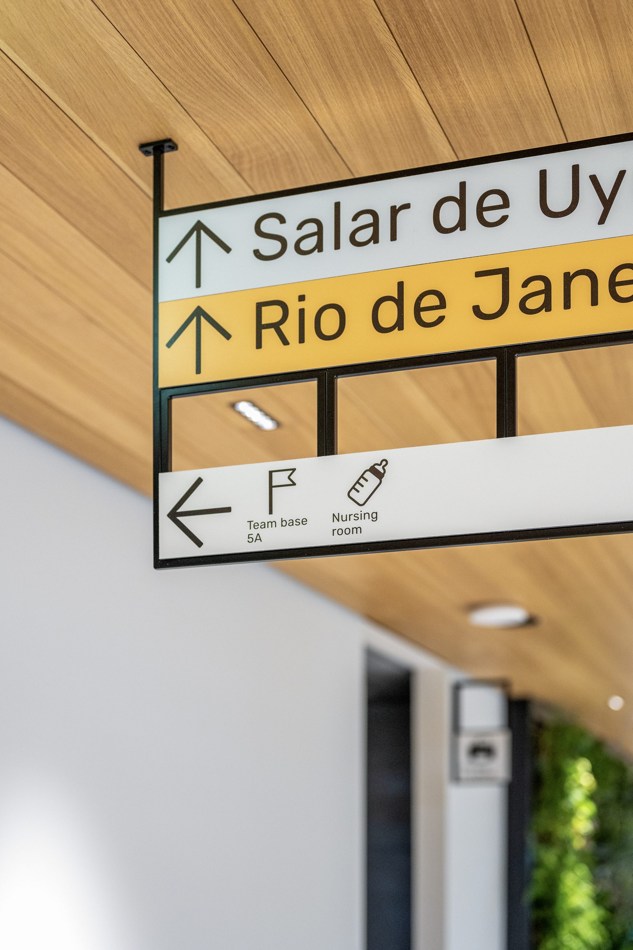
We designed navigational elements that give an overview of the whole space providing nudges and validation when needed. The grids are constructed modularly: they can become smaller or grow in size, adjusting to informational needs. Tailor-made typography, such as the large numbers visible from the moment you step into the atrium, is also used to stand out and grab your attention. All of the wayfinding information is strategically placed to give the user a sense of confidence and independence. On that note, we invoked a concept of ‘micro-holidays’ to organize the space, strengthening Booking.com’s identity while adding playfulness.
Experience
The Booking Campus is a place where people come together. It celebrates the work and creativity of the employees, and it houses the spirit of the global citizen. The micro-holidays are locations dubbed as bite-size destinations where people meet and collaborate, embodied with perfectly selected color palettes. This creates a sense of place and encourages exploration and playful associations, combining spatial design and employer branding. Surprises await in every corner, with wayfinding effortlessly unifying all elements.
Related projects
Let's talk wayfinding.
Finding one’s way in a corporate or urban space should be effortless. Reach out to us, and let’s get to work on your challenge.

